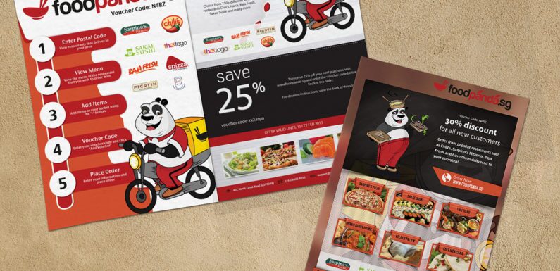
Flyers can be one of the most effective as well as inexpensive ways to promote one’s business. It does not matter the size. As a matter of fact, a survey has been conducted by the DMA i.e. Direct Marketing Association that more than 49 percent of leaflet or different types of flayers recipients directly or indirectly act on the ad by either get in touch with the business or requesting some additional information. While the distribution of flayers has been used for the purpose of marketing and business promotion all around the world. It has started getting extensive popularity for marketing.
However, not all custom flyer design serve the purpose of marketing well at the present-day marketplace, but most of them work well enough. The objective is to grab as well as hold the attention of the people long enough for them to know and to read your flyer and then work on it.
How do you attain this objective? Here are some of the most successful as well as proven ways that the majority of professionals use to make their flyers truly pop. Let us discuss seven creative ways to make a flyer that help your flyer stand out.
Always Write Catchy Headline or Title:
Try to write the flyer headline catchy, snappy and attractive that tells something. Carefully choose some powerful words that display your brand. A popular title, which contains one or more words that is easy to read and understandable is good. Avoid ambiguous words and most of the people do not understand. Your words should have an unlocking power of the mind of the readers.
Always Use Colorful or Striking Graphics:
One large and easy to visualize image not only creates impact than many smaller images but also helps to remember the entire brand concept, for which you are making your flyer. A stunning photo or illustration on the flyer helps to grab attention, creates the mood of the perceivers and supports your brand story at the same time. A colorful and striking graphics is a focal point of a flyer and helps to catch people’s attention.
Focus on the Benefits of your products or services:
Your prospects will certainly question you, “What is in it for you?” Write from their angle of vision utilizing the words “Me” “You” and “Your”. Try to give up using the words like We, Us, I or Our. These types of words do not make good sense on your flyers.
You need to be sure to keep your text short, simple and concise, better to say to the point for the readers. Generally, readers do not have time to read your flyers, because there are hundreds of thousands of flyers already they come across, when it is very, very good, then only they like to read for once or twice.
Try to use Compelling testimonials & case studies:
Nothing strikes like a string and an endorsement from a satisfied customer, particularly whether it demonstrates the outcomes they have had with your products and or services. You should not forget to mention the first name, last name and name of your company, including the location of the individual who provides an endorsement.
Make Points quickly and easily identifiable:
Highlighting the titles as well as subtitles in bold, but avoiding all words in caps are much difficult to read and understand, so you should remember before you us this.
Do not make it very difficult to understand or complicated:
Make it as simple as possible with two typefaces, which is very, very essential, and align items to a grid that suits your flyer. Your page layout program will certainly provide non-printing guidelines, which is one of the most important things in designing a business flyer.
Do not forget to proofread:
You have somebody else to proofread your flyer document, it works better. Try to cross-check your contact information, phone number etc to make it sure that is proper and correct and type your URL of the website or blog to make sure you are about to give all information to your potential customers.
Whether you are on a small budget, you should think how to make it at the beginning of the design. You can provide a discount offer or something special that is limited time price to call more and more potential customers to buy your products and or services via your flyer.
Last, but certainly not the least, design a flyer or designing a coupon on the bottom quarter of a flayer is not a daunting task if you have a designer and you have the concept what to do and what for you are about to design one. You should make it sure that your flyer is not just a thing through which you are about to advertise or promote your product or service, it is more to do and lot more to work with.
You do not need to reinvent the wheel in the time you are about to create a good flyer that says something about your brand. If you do not have a designer to do it, you can hire a temporary one and tell him to use these proven techniques. You will certainly see the biggest outcome of your marketing effort, which will give your business a boost for which you are working hard with your flyer.


