Do you know that mobile apps convert more users than desktop traffic? In a world, where mobile phones are widespread, getting an app means not only more conversions, but a private space right on the user’s smartphone.
When your website turns into an app, the icon will be readily available on the user’s smartphone, making them aware from time to time that your app exists.
Moreover, you will be permitted to send them push notifications of sales, discounts, and other relevant promos that they can redeem if they found the deals interesting. This is surely not possible with a website-only approach.
But, can you increase the app conversions even further? What design elements to keep in mind to move the conversions one notch up? Are there any rules to follow? Let’s find out.
In this article, we will discuss:
- What app design that converts looks like?
- What are conversions in app marketing?
- How do you design for conversion to make profits?
- Design factors that affect app conversion rate
A wise man once said: Conversion rate is the only golden marketing metric. All else is just gold dust.
Every work you do, every effort you make, it all comes down to conversions. But what are conversions, and do they differ from business to business?
What App Design That Converts Looks Like?
Simplify everything.

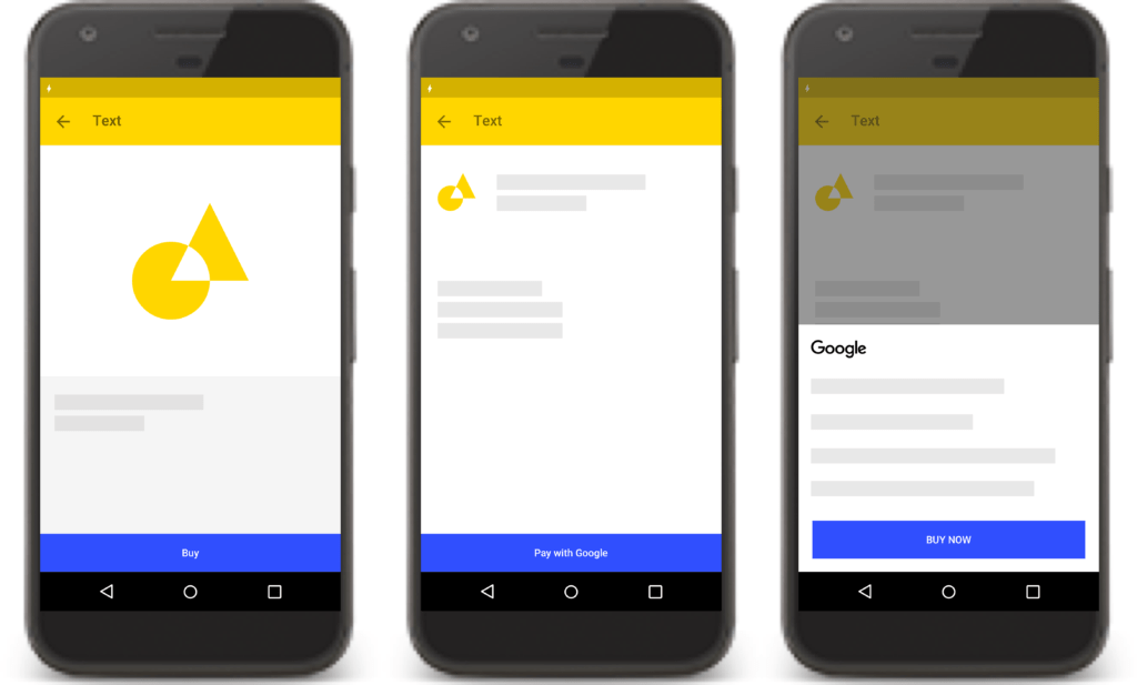
In the above image, you know by the icons what the activity is all about. Without even thinking for the second time, you know that you are about to purchase a product.
And, once you purchase the product, you are taken to the checkout page. Everything is filled already, and you simply have to place the order.
This is what a simple app design is all about. It lets you know what to expect and when to expect. No confusion and no beating about the bush.
What are Conversions in App Marketing?
According to WordStream, a conversion is any action that leads to the desired goal, or closer to the desired goal. Conversions can be leads, sign-ups, online sales, or even form completion.
It depends on business to business, but the end goal is always the same ‘closer to the desired goal’. In most ecommerce apps, conversions would mean online sales.
How Do You Design for Conversions?
A good design is where the users can easily get to the buy-stage without any hindrances. To create such a design, the designers will have to empathize with the users. It means getting in their shoes and seeing the app from their angle.
Let’s say, you create a mobile app for people who would like to order groceries online. What do people want to see?
- Price
- Expiry Date
- Delivery charges
- Discount (if any is available)
- Search bar to easily search for relevant items
- Pictures of groceries
These are some basic elements that one would require when ordering groceries.
Now when you have a basic layout design prepared, the actual work starts. It is time to split test various designs. In one design, you will have the CTA button small, in another one, it will be big and colored in a different shade.
It all depends on what works. You will have to test it for a week or so to find out, provided that you are getting enough traffic.
Design Factors That Affect App Conversion Rate
Now let’s take a closer look at eight design factors that affect the mobile app conversion rate.
1. Ensure Fast Loading Time
The application should load faster than a second. It is not a website where the visitor will wait for a few seconds to load the screen. It is an app on the smartphone.
So, the app should load in milliseconds. This means the pace should be very fast, from the loading screen to the checkout page.
2. A/B Test Your App
You should always A/B test your app before finalizing it. A/B testing can increase the conversion rate by almost 100%.
A/B testing lets you test out different hypotheses for experiences within your app and make variations to this experience based on authentic data instead of gut instinct.
A/B testing tools enable you to ascertain with statistical confidence what the influence of changes you make to your app will have, and quantify exactly how great that impact will be.
If you are not sure how to A/B test, there are many resources available online. Google has written a complete course on A/B testing of mobile apps.
3. Make Clear CTAs
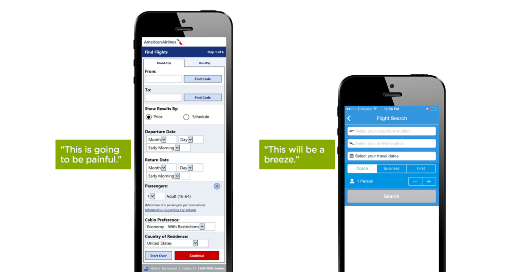
Sometimes, only changing the CTA matters. Apps also have CTAs on every page, just like websites. Changing only some text of the CTA can have a drastic impact on the conversion rate. Take this example:

In this example, which one do you think will be easier for the user? Obviously, the second activity is easier to fill. People don’t like to fill lengthy forms, and when these forms are on apps that are on our small-screen smartphones, filling forms is a BIG NO!

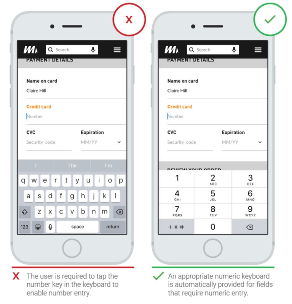
Similarly, make sure that you have the right type of options available for users. Otherwise, they will simply uninstall your app. In the above image, for a credit card number, what type of keypad will work faster? You know the answer.
4. Use consistent branding throughout
Professional apps are likely to have a higher conversion rate. People can easily find out if an app belongs to a brand, or it is a replica. Therefore, if your branded app doesn’t have consistent branding throughout, you should get that done first.
Branding doesn’t mean adding a logo on every screen of the app. It means you need to keep the same tone of colors on every screen, so that it gives the same feeling.
5. Incorporate human touch
Is your app related to social media? Games? Then add a human touch to it. Games that have the characters on the login and signup page are likely to get more conversions in comparison to pages with no characters on the signup page.
6. Watch how visitors navigate your app
You can track how people go through your mobile app through firebase. Firebase offers a complete app analytics solution that allows you to track everything from a single swipe to a click.

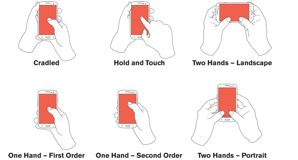
These are some basic functions that visitors will use to get to your app. Every app uses the same functions, and these will help you determine what type of actions you should expect from the users. These will also impact your conversion rate.
Not everything demands complexity, and that’s what CRO experts often fail to understand.
7. Beta testing
Once you are done creating the app, do a beta test among your peers. Beta testing can help you find glitches that were previously unknown to you.
Maybe there was a color that you missed, maybe the CTA button was not too visible, these types of issues can arise, and beta testing helps solve them.
So, ask your close friends and family members to test your app for a few weeks and then provide you a review and suggest changes that you can make.
8. Copy shamelessly
Yes, this is the truth, and the Harvard Business Review endorses it. While many will call you a copycat but they will envy you as soon as you become successful. Copying better designs is the key to success.
You don’t have to copy the same design, simply create a few alterations to check if they increase the conversion rate. If they don’t, then move back to your previous design or try some other design.
Designing for Conversions The Right Way
As discussed earlier, bringing prosperous conversions leads you to a path of improvement. Why? Because when you focus on improving your sales funnel, you will automatically bring in new sales. But when you take it as a goal and only focus on conversion, then you won’t understand what improved the numbers.
Moreover, it is important to understand that design alone is not a factor that improves conversions. There are many other elements involved like persuasive writing, the context of the product, and the price at which it is available.
No matter how great your app design is, if the product you are selling is of no use, it won’t sell. Similarly, if the product is highly-priced, people won’t buy from your app. So, make sure you keep all these things in mind while discussing design based conversion optimization.
Our customers have become smarter than ever. They can easily find out which store is selling a product for the lowest price. So, no matter how poor looking layout that store has, they will buy the product from that store. Keep these key points in mind and get ready to see your conversions go up!

