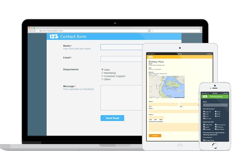
One of the best ways to acquire genuine user information and maintain customer relationship is to embed a web form in your website design. You must have seen that almost all websites have a form on the “contact us” page and by filling up that form users can get an answer for their specific query from the company. Here are some guidelines that will help you create the perfect business form for your website’s contact page.
Unleash your creativity: Many website designers think that contact us page is the least important page of the website and don’t pay much attention to the design standard. Just because you are designing a web form, it does not mean it needs to look boring. Make it look friendly and inviting so that people happily fill up the form. Also, make sure that it matches with the theme of the entire website to ensure customers that they are dealing with the same brand they trust.
Use simple language: Let the users understand effortlessly what you want them to do and what will they get in return. For instance, if it is a product inquiry form, you can use a bold headline above the form such as “if you have any questions about our products, please fill up the form”. Simple language and direct approach are the key factors to engage customers.
Make the form manageable: Customers don’t like lengthy web forms but as a businessman, you wish to know as much about your customers as you can. So, the solution is to break a long form in 2-3 parts. Users will be more comfortable as they will progress step by step. If you need any help in website design, you can contact a Las Vegas Web Design Co for professional services.
Warn for errors: If a user has made a mistake while filling out any particular data field or skipped something, your website must prompt the user that he has made a mistake. For instance, you can mark the blank section/error in red color to help the end user identify his mistake quickly.
Preserve correct data: Web users are extremely impatient and they don’t like to spend too much time to share their personal information with you. Therefore, your website must save their data as soon as they enter it in the form. This way, even if they make a mistake, only rectifying that mistake will be enough; they don’t need to start filling up the form from the very beginning.
Use easy to read fonts: Most of the people use mobile phones and tablets to access websites nowadays. Therefore, you must choose a font style that can be read easily and also make the font large enough to ensure readability across mobile and PC.
Design a clear end button: There must be an end button at the bottom of the web form so that a user can understand his work is done. Create a large button and write something like “send” or “submit” on it to avoid any confusion.
Conclusion
Website design is not just about the home page or product page design. All the elements of a website must look beautiful and work perfectly to keep the customers glued to your website. Be it a web form or the navigation system, you must design each and every element of the website with utmost dedication.

